在日常 Vue 项目开发中,我们难免需要写一些基础公共组件,在大型项目中,我们难免会遇到下面的痛点:
- 组件 API,对于 Vue 组件,有 props、event、slot 等接口,在团队内需要一定的沟通成本
- 对于 UI 组件,还需要提供预览,方便团队内快速选择合适的组件
如果使用 Markdown 撰写,虽然能写 API 文档,但是无法提供组件预览,并且手动写文档的成本也很大好在有一个这样的库,可以提供自动化文档的生成,并提供组件预览,这个库叫做 Vue Styleguidist。
安装
首先,Vue Styleguidist 只能适用于 Webpack 打包的项目,在此基础上,我们需要安装 vue-styleguidist 这个包:1
npm install vue-styleguidist --save-dev
然后在 package.json 配置下面两行命令,分别用于开发预览和部署打包:1
2
3
4
5
6{
"scripts": {
"styleguide": "vue-styleguidist server",
"styleguide:build": "vue-styleguidist build"
}
}
如果是使用 @vue/cli 3 生成的项目,可以直接使用 vue-cli-plugin-styleguidist 这个插件进行更快捷的安装和配置
组件源代码
这里为了进行简单的演示,我们使用了 @vue/cli 3 生成项目,创建组件 src/components/AppButton/AppButton.vue。我们的组件源代码如下,下面的案例都会依照此源代码进行展开:1
2
3
4
5
6
7
8
9
10
11
12
13
14
15
16
17
18
19
20
21
22
23
24
25
26
27
28
29
30
31
32
33
34
35
36
37
38
39
40
41
42
43
44
45
46
47
48
49
50
51
52
53
54
55
56
57
58
59
60
61
62<template>
<button
class="btn"
:type="htmlType"
:class="btnClass"
:disabled="disabled"
@click="handleClick"
>
<slot />
</button>
</template>
<script>
export default {
name: 'AppButton',
props: {
theme: {
type: String,
required: true,
},
outline: {
type: Boolean,
default: false,
},
size: {
type: String,
default: '',
},
block: {
type: Boolean,
default: false,
},
disabled: {
type: Boolean,
default: false,
},
htmlType: {
type: String,
default: 'button',
},
},
computed: {
btnClass() {
return {
[`btn-${this.theme}`]: !!this.theme && !this.outline,
[`btn-outline-${this.theme}`]: this.outline,
[`btn-${this.size}`]: !!this.size,
'btn-block': this.block,
};
},
},
methods: {
handleClick(e) {
this.$emit('click', e);
},
},
};
</script>
<style lang="scss">
@import '~bootstrap/scss/bootstrap';
</style>
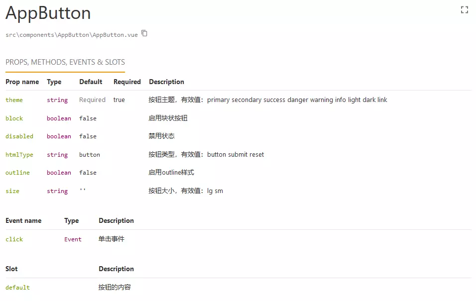
Props
Props 是组件最基本的 API,用于为组件传递数据,实际上,在配置好 Vue Styleguidist 之后,如果有写 prop,就已经能生成一个如下这样的文档:
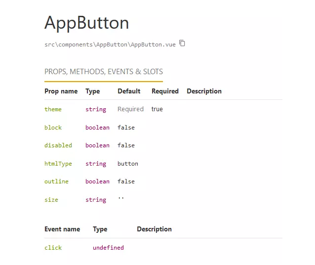
我们可以看到,此时已经带出了 Props 的名称、参数类型、默认值、必填性等等,我们仅仅需要为 prop 写上相应的注释进行描述,像 JSDoc 一样,就能生成一份完整的 Props 说明:1
2
3
4
5
6
7
8
9
10
11
12
13
14
15
16
17
18
19
20
21
22
23
24
25
26
27
28
29
30
31
32
33
34
35
36
37
38
39
40
41
42
43
44
45
46export default {
props: {
/**
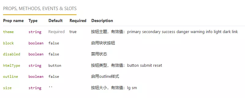
* 按钮主题,有效值:
*/
theme: {
type: String,
required: true,
},
/**
* 启用outline样式
*/
outline: {
type: Boolean,
default: false,
},
/**
* 按钮大小,有效值:lg sm
*/
size: {
type: String,
default: '',
},
/**
* 启用块状按钮
*/
block: {
type: Boolean,
default: false,
},
/**
* 禁用状态
*/
disabled: {
type: Boolean,
default: false,
},
/**
* 按钮类型,有效值:button submit reset
*/
htmlType: {
type: String,
default: 'button',
},
},
};
最终会得到一份完整的 Props 说明,如下图:
Events
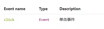
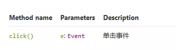
除了 Props,Event 事件也是 Vue 的一个重要的 API 之一,可以通过 v-on 为组件绑定事件,Vue 的事件使用 vm.$emit(‘event’, …params) 的方法进行定义,我们只需要在这个方法之前,加上必要的注释就可以了。如果事件名不是字符串,可以使用 @event 进行标注事件的参数使用 @type 进行标注:1
2
3
4
5
6
7
8
9
10
11export default {
methods: {
handleClick(e) {
/**
* 单击事件
* @type {Event}
*/
this.$emit('click', e);
},
},
};
文档生成如下:
Slots
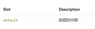
Slot 插槽是 Vue 的自定义元素之一,Slot 向一个组件传递内容,也是封装公共组件常见的 API 之一,与 Props 和 Events 不同的是,Slots 通常是定义在 template 部分,不能使用 JS 注释进行标注,需要使用 HTML 注释,并且在注释里使用 @slot 进行标注:1
2
3
4
5
6
7
8
9
10<button
class="btn"
:type="htmlType"
:class="btnClass"
:disabled="disabled"
@click="handleClick"
>
<!-- @slot 按钮的内容 -->
<slot />
</button>
文档如下:
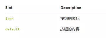
如果使用的是具名 Slot(具名插槽),则会自动生成插槽名称:1
2
3
4
5
6
7
8
9
10
11
12<button
class="btn"
:type="htmlType"
:class="btnClass"
:disabled="disabled"
@click="handleClick"
>
<!-- @slot 按钮的图标 -->
<slot name="icon" />
<!-- @slot 按钮的内容 -->
<slot />
</button>
生成文档如下图:
Methods
看到这里可能各位会有个疑问,Methods 和 Events 有什么区别?区别主要有以下两个:
- 定义方式不同:Methods 只要在 methods 里定义函数即可,Events 则需要使用 vm.$emit(‘event’, …params) 进行定义
- 调用方式不同:Methods 使用 vm.$refs.ref.method() 这样的方式进行调用,Events 使用 v-on 指令或者 vm.$on(‘event’) 进行监听
实际上,使用 Methods 方法封装组件 API 的情况是比较少的,但是依然不能排除这种情况。对于 Methods 方法,我们只需要像使用 JSDoc 一样为函数进行注释就可以了,最后再附上 @public 进行标识:1
2
3
4
5
6
7
8
9
10
11
12export default {
methods: {
/**
* 单击事件
* @param {Event} e
* @public
*/
click(e) {
// some code
},
},
};
生成文档如下:
编写样例
通过上面的例子,我们将至少得到一个这样的文档:
这个文档把该有的 API 都暴露出来了,但是它并不是完美无缺的:
- 直接对比 Markdown 文档,并没有明显的优势
- 缺乏组件 UI 样例
在文章的开头,我们说过,UI 组件需要为团队提供样式预览,并且需要自动生成。很遗憾的是,Vue Styleguidist 并不能直接生成预览样式,这个需要手写样式代码。在 Vue Styleguidist,有两种编写组件样例的方式:
- README方式
- 组件方式
README方式
在组件的同个目录下,新建一个文件 README.md,比如src/components/AppButton/README.md,然后直接调用组件代码:
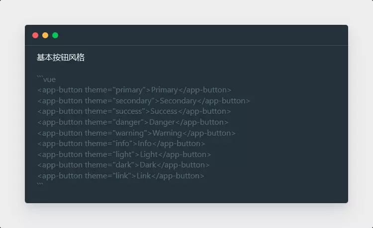
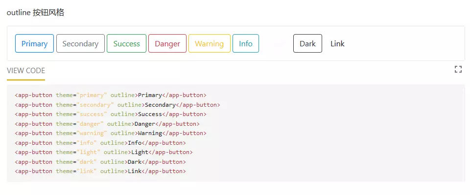
这样我们就能快速简洁的生成一个预览+示例代码了:
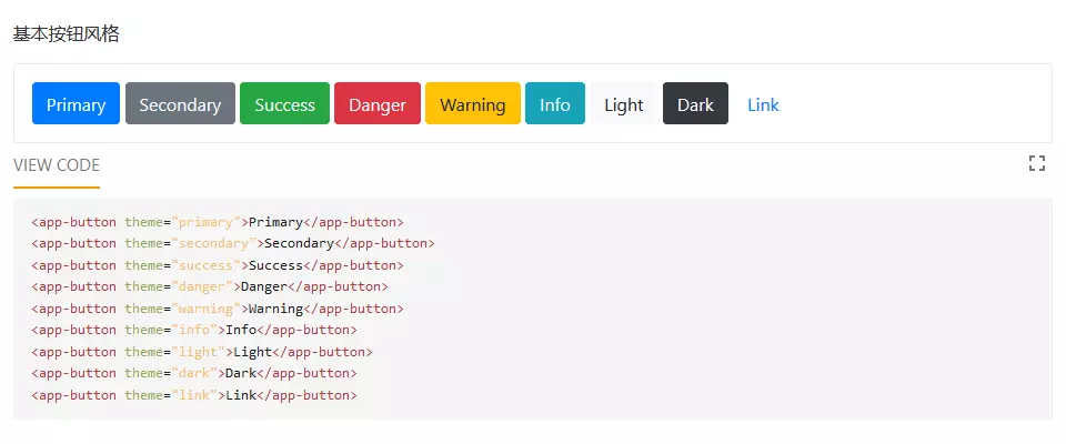
我们也可以为组件传入 Props,预览组件的表现:
生成文档如下:
组件方式
可以直接在组件下方增加一个组件 “
配置
Vue Styleguidist 支持自定义配置,只需要在项目根目录下,创建 styleguide.config.js,就可以参照官方文档进行配置:1
2
3
4
5
6
7
8
9
10
11// styleguide.config
module.exports = {
title: 'Default Style Guide', // 文档的标题
components: 'src/components/**/*.vue', // 组件的目录
defaultExample: false, // 是否使用默认样例
usageMode: 'expand', // 是否展开用法
exampleMode: 'expand', // 是否展开示例代码
styleguideDir: 'styleguide', // 打包的目录
codeSplit: true, // 打包时是否进行分片
skipComponentsWithoutExample: true, // 是否跳过没有样例的组件
};
注意事项和总结
注意事项:
- JSDoc 的标签仍然有效
- TypeScript、Flow 和 Class 组件同样可以使用,只是使用方法稍有不同
- JSX 也可以使用
总结,通过 Vue Styleguidist,我们将至少得到下面两项好处:
- 完整的组件 API 和用法
- 直观的组件预览
另外我认为还能得到以下几项好处:
- 完善的注释
- 较小的 UI 调试成本
- 减少团队内部沟通成本
Vue Styleguidist 实际上还拥有多种配置和用法,各位感兴趣可以去官网看看文档。